So, since I wrote a couple of days ago, there has been progress! The website is almost ready, just a snag list and some more content to upload before we launch next week. I’m pretty excited to launch and, yes, you’ll be able to book in for product descriptions and photo shoots from Monday (all being well)!
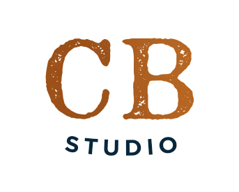
But today, I wanted to share my new branding for Copper Boom Studio.
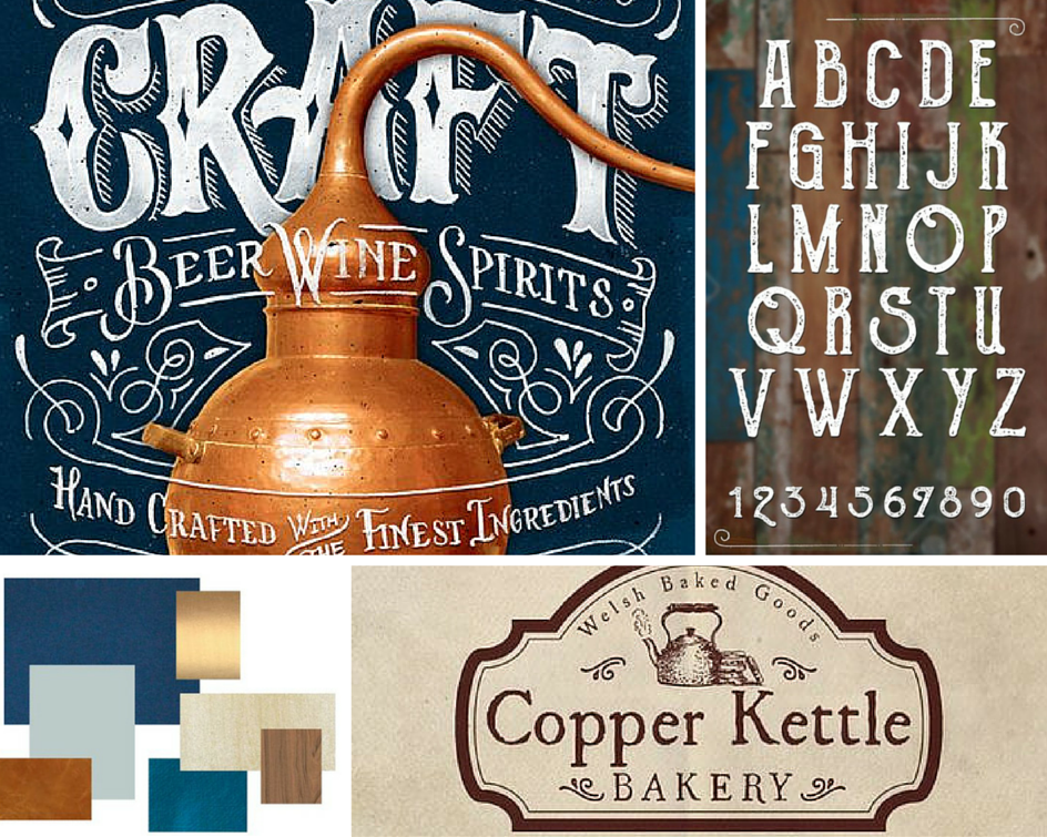
First, here’s a reminder of some of the pins from my brand Pinterest board:
You can see the full board here. It’s the actual references I gave to Evan while she was designing the logo and the website.
I also gave Evan some direction on brand values (one of my favourite things to work on with clients), which included timeless, slick and dependable. These things are really important to Copper Boom, to the work we create and the services we offer, so I want them to come out in the branding, website and social media.
And it turned into this:
Of course, we have a couple more variations, including white text on the blue background, as well as a couple of other shapes to use. Evan has created an awesome brand sheet that I love, and I’m over the moon with the colours and fonts we’ll be using.
I’ll be sharing some more sneak peeks from the studio this week over on the Copper Boom Instagram and Facebook pages, which you can now follow. Plus, the website launches on Monday, and you can sign up now to be the first to know!
What do you think of the new branding? What do you think of this Big New Idea? Do you like it? I’d love to hear!
Jx


